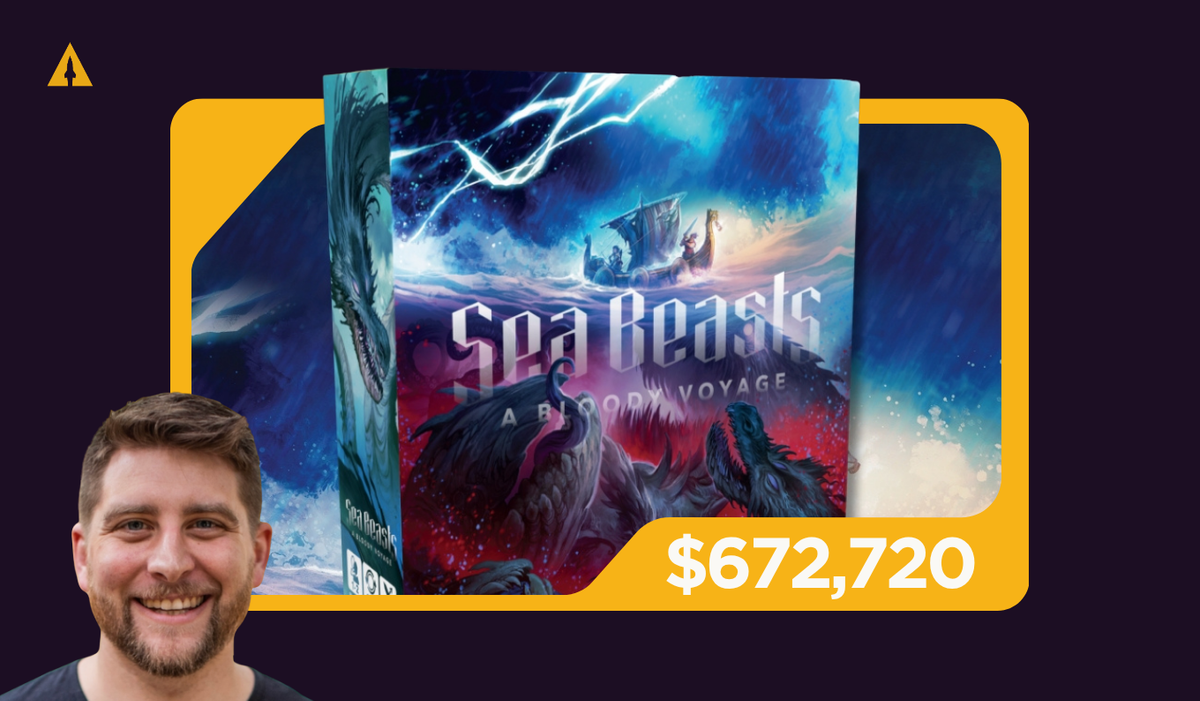
Case Study: How Aaron Smith Turned a Failed Campaign into a $673K Kickstarter Success
On his first launch, Aaron Smith had the kind of outcome that, for many creators would mark the end of the road. But he took that failure and treated it as a turning point.
After three years of designing, playtesting, and refining his board game Sea Beasts, Littlest Lantern founder Aaron Smith thought he was ready to launch — and he chose Gamefound as the place to do it.
The game was solid, the theme was compelling, the mechanics worked. By every measure, Sea Beasts was ready. After tons of work and dedication, Aaron went to hit launch and then… the campaign failed, raising just $35,586, far short of what Aaron needed to manufacture and fulfill.
Despite having a game concept he believed in, with no surge of backers and no meaningful traction, it was clear something wasn’t connecting. For many creators, that kind of outcome would mark the end of the road. Aaron took that failure and treated it as a turning point.
What followed was a complete shift in how he approached marketing, audience, and validation, a shift that led to a Kickstarter relaunch of the very same game that raised over $672,720.
To understand how Aaron got there, let’s unpack the radical change in his strategy.

Launching A Game Without An Audience — Finding His Superfan
When the original launch fell flat, it became clear creating a great game and communicating its value were two entirely different challenges.
The project had promise, but it was failing to connect with its intended audience. The insight that inspired Sea Beasts and made the game unique had never made it into its marketing. Instead, the campaign had relied on generic gaming messaging which got lost in a sea of competing board game projects. It lacked strong audience signaling and didn’t highlight the core gameplay experience in a way that helped people immediately “get it.” While Sea Beasts had a clear intended target audience, the campaign around it did not. Something had to change.
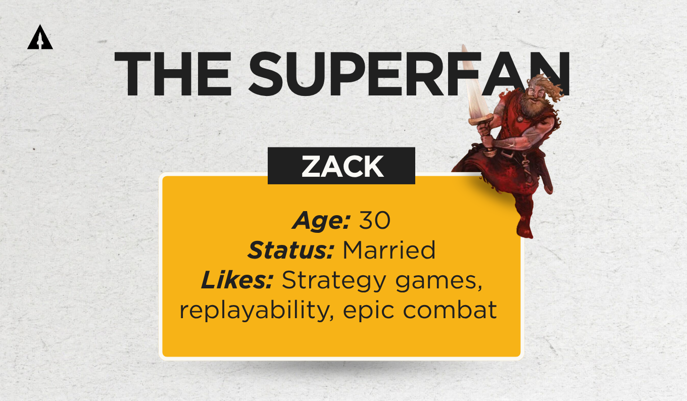
Step one of tying everything together was identifying his audience. Instead of trying to appeal broadly to “board game players,” he defined a very specific type of player– his ideal customer, or what LaunchBoom calls the “Superfan.”
This was a completely new concept for me. I designed the game specifically for essentially people like me who didn't have a whole lot of time to play games, had a young family, had a spouse, and really wanted to have a game [that] if you wanted to play it solo or like you could bring non-gamers along, but it was a game really for like hobby gamers. That's kind of where I started with my Superfan. I called him Zack ‘cause I had lots of friends [named] Zack, and I kept meeting Zacks everywhere and I was like, "All right, he's going to be Zack”.
Zack wasn’t just a vague demographic profile. He represented a lifestyle and a mindset. He was someone with limited free time, interested in games that felt meaningful without being overwhelming. He enjoyed strong themes like Viking adventures, appreciated replayability, and valued games that were easy to set up but still offered strategic depth.
Identifying the Superfan gave Aaron something he hadn’t had before: a clear reference point. Every decision that followed, visual design, messaging, ad targeting, was built around appealing to that specific person.
Choosing The Right Platform
After hitting pause on the Gamefound campaign, Aaron had to assess what led to its failure and come up with a clear strategy to ensure that whatever relaunch came next would tackle all of the issues of the first campaign.
Yes, Sea Beasts’ marketing strategy needed a complete overhaul, and Aaron needed a clearly defined audience to target, but the changes started on an even more baseline level: instead of attempting another Gamefound campaign, Aaron chose Kickstarter for the relaunch.
This choice, which would prove to be the basis of Sea Beasts’ eventual success, was rooted in Kickstarter’s stronger potential for built-in discovery (especially for a first-time creator). Kickstarter tends to bring in a broader audience, which means a significant portion of backers can come organically instead of relying entirely on ads.

That was important for Sea Beasts, since the campaign relied on testing and on reaching new people outside a specific niche. While Gamefound is great for established tabletop audiences, Kickstarter gives more exposure to casual backers and crossover interest, a huge benefit for Aaron who was a newcomer into the tabletop space and was working on establishing a brand new audience with Sea Beasts.
Kickstarter made it easier to scale beyond the core audience and drive more overall momentum.
For the Kickstarter relaunch, Aaron approached everything differently. The other immediate change he made was opting to not attempt to run the things alone. Instead, he joined forces with LaunchBoom to refocus and create the pre-launch campaign that would sail Sea Beasts to victory.
A Landing Page That Guides Decisions
With a defined target audience in mind and a platform chosen, the next step was creating a landing page that would convert interest into action. Using LaunchBoom’s software LaunchKit, Aaron crafted a landing page that showcased everything about Sea Beasts that the potential Superfan would be drawn to.
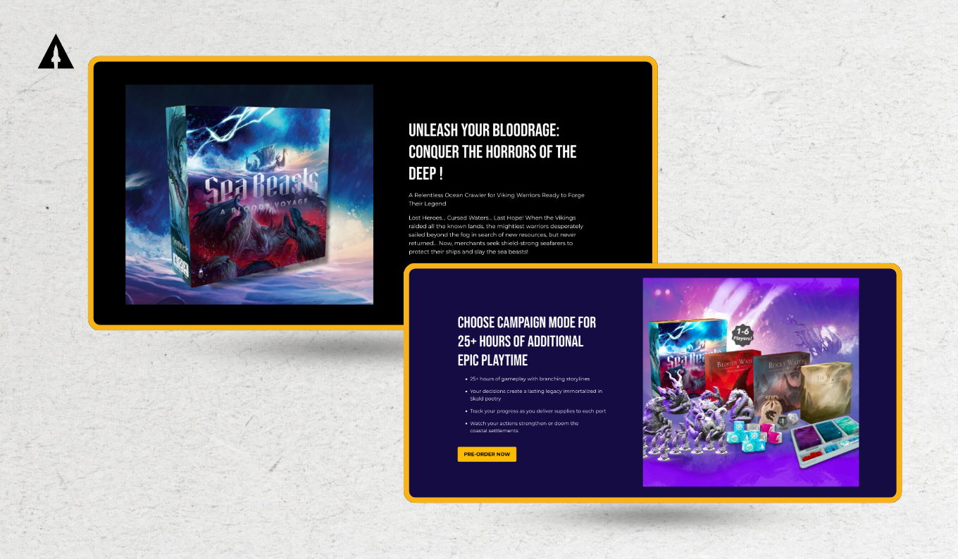
The structure of the page was deliberate. The opening section combined a strong visual with a headline that quickly communicated the core of the game: its Viking theme and eye-catching game art, its cooperative nature, and the sense of high-stakes adventure. Within seconds, a visitor could determine whether the game aligned with their interests.
Instead of immediately listing features, the page introduced the world of the game, its setting, tone, and narrative. This helped potential backers imagine the experience before evaluating the specifics.

Only after that did the page begin to highlight tangible elements like miniatures, gameplay structure, and component quality. Clear information about playtime, player count, and difficulty level was included to mirror the kind of quick evaluation someone might make when picking up a game in a store.
Call to action sections were strategically placed throughout the page, not just at the top or bottom. The goal was to capture interest at the moment it peaked, rather than forcing users to scroll back whenever they were ready to sign up.
The entire page was designed to maintain momentum. Each section led naturally into the next, reducing friction and uncertainty and ensuring maximum email sign-ups.
Finding Visuals That Connect
When it came to advertising, Aaron avoided the trap of overproducing his creatives. Instead, he focused on variety.
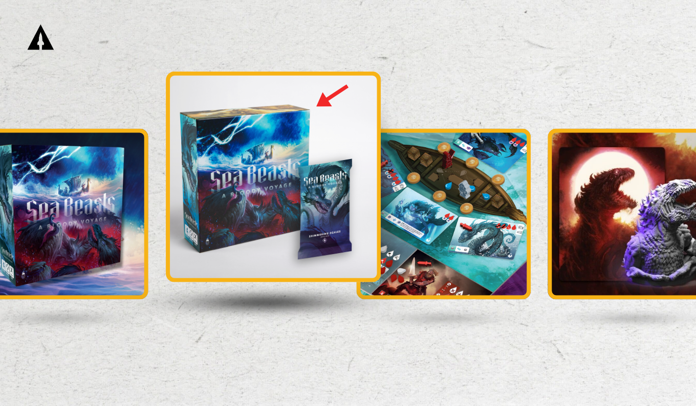
He tested four different types of visuals: one that emphasized the game’s thematic artwork, another that clearly presented the product on a plain single-color background, one that showcased gameplay components, and one that highlighted the miniatures, which were a major selling point.
None of the visuals were highly complex productions. They were all created by Aaron using simple tools like Canva and Illustrator. What mattered was the differentiation: each visual offered a slightly different perspective on the product, allowing the data to reveal what resonated most during testing.

Copy That Reflects Real Experience
The same philosophy applied to the ad copy. Rather than relying on a single message, Aaron again tested four different approaches, each designed to hook attention in a different way and speak to a slightly different motivation.
The hyperbolic headline, “The ultimate game of Vikings vs beasts”, leaned into authority and scale. It was designed to stop the scroll and create instant curiosity.
The feature-based headline, “A fast-paced Viking-themed ocean crawler”, anchored the game in concepts that would be familiar to hobby games and provide a quick, understandable reference point. Calling it an “ocean crawler” gives a quick mental model akin to dungeon crawlers, while “fast-paced” and “Viking-themed” layered in tone and setting.
The headline highlighting gameplay actions and goals, “Survive, explore, and fight monsters in this strategic co-op”, outlined the experience in simple, direct terms that allowed audiences to immediately picture themselves immersed in Sea Beasts’ gameplay.
Finally, the short soundbite “Viking warriors wanted” relied on instant emotional pull. It invited the viewer to step into a role, drawing clicks from people who responded to the theme without needing a full breakdown.
By testing each of these styles against the same audiences, the campaign could see not just what performed best but why. Some people respond to clarity, others to hype, others to identity. Running all four made it possible to capture those differences and use them later when scaling.
Another notable improvement came from the use of testimonials from board game reviewers.
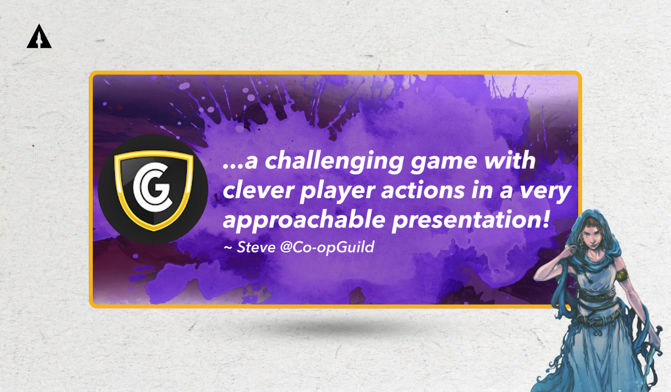
Generic statements like “this game is fun” had little impact but genuine, specific feedback, such as describing how quickly a failed attempt could turn into a new game, or how certain mechanics created tension, helped potential players picture the experience more vividly.
That specificity made the game feel tangible. It shifted the messaging from abstract promotion to something closer to a relatable firsthand account players could identify with.
Letting The Data Shape the Audience
One of the more counterintuitive decisions in the process was to start with broad audience targeting.
Instead of narrowing in immediately on a highly specific niche, Aaron’s campaign initially targeted wider groups such as board game enthusiasts, tabletop players, and fans of fantasy themes. Even niche categories like Lovecraft-inspired content were included, despite not being an exact match for Sea Beasts.
The reasoning was simple: narrow targeting early on in the campaign limits the amount of data you can gather. Without sufficient data, it becomes difficult to identify what is actually working.
Committing to targeting a broader audience, the marketing campaign embarked on a structured testing process, isolating one variable at a time:
Creative Visual Test (what people see first)The first test focused only on images, presenting the same copy with different visuals.
- Cost per lead: $4.77
- Cost per purchase: $26.95
- Purchases: 23
- Landing page conversion rate: 13.43%
While those numbers were nothing exceptional, they provided a baseline and identified which visuals resonated best with Aaron’s audience. More importantly, the test generated enough conversions to move forward with confidence.
Headline Test (what grabs attention)Using the best-performing visual, this test then rotated different headlines.
- Cost per lead: $4.10
- Cost per purchase: $30.45
- Purchases: 19
- Landing page conversion rate: 23.62%
This was a clear improvement from the first test, boasting lower cost per lead and a jump in conversion rate. It showed the messaging was starting to connect better with the same broad audience.
Primary Text Test (the core message)Here, the visuals and headlines were the constant while testing different body copy.
- Cost per lead: $6.65
- Cost per purchase: $101.10
- Purchases: 5
- Landing page conversion rate: 14.81%
Performance dropped during the final test, but even that seemingly negative turn still provided useful information. It ruled out weaker messaging and helped avoid scaling something that wouldn’t hold up.
Overall Test Results (combined learnings)After consolidating the best elements from each test:
- Cost per lead: $4.34
- Cost per purchase: $24.78
- Purchases: 95
- Landing page conversion rate: 19.22%
By starting broad, the campaign was able to collect meaningful performance insights, which then informed more precise targeting during the scaling phase. The campaign was sitting close to benchmark, with a projected ~2x return on ad spend, which was strong enough to justify scaling.

Scaling With Evidence, Not Assumptions
By the time the campaign reached the scaling phase, Aaron wasn’t guessing anymore. Following the testing phase, he had a clear sense of which combinations of visuals, messaging, and audiences were performing well.
During scaling, two strategies proved especially effective.
The first was targeting VIP audience lookalikes based on high-intent users. The VIP audience were people who had already shown strong interest and had signed up through the $1 reservation funnel.
Those VIP lookalike audiences were people whose demographic profile, interests and content engagement tendencies closely resembled the campaign’s most engaged VIP potential backers, leading to significantly lower acquisition costs and higher conversion rates.
And it was crazy when we got those, like, VIP lookalikes. We just had that brand new audience that was just fresh, that was specifically the people that I was trying to reach, which was so cool. And it was minimally spending too, on those tests. It was just like, a little bit of spending kind of honing in like on that target, and then it really paid off long term.
The second strategy was to expand geographically. Once strong-performing ads and audiences had been identified, they were introduced to new regions, effectively increasing reach without sacrificing efficiency.
VIP lookalikes (based on ~95+ early VIPs):
- Cost per lead: $2.39
- Cost per purchase: $8.64
- Purchases: 633
- Landing page conversion rate: 23.93%
Top audiences expanded into new regions:
- Cost per lead: $1.54
- Cost per purchase: $8.05
- Purchases: 718
- Landing page conversion rate: 24.49%
Because these scaling decisions were grounded in tangible data, increasing the advertising budget felt less like a risk and more like a calculated step.

From Pre-Launch to Funding Success
The impact of this approach became clear at launch.
Before the campaign even went live, Aaron had built a substantial audience, including thousands of email subscribers and a large group of highly engaged VIP supporters. These were people who had already demonstrated interest and, in many cases, statistically bigger intent to purchase.
When the campaign launched, that preparation translated into immediate traction. The project’s initial goal of $15K was fully funded just 11 minutes after going live on Kickstarter, and that was just the beginning of what would become an overwhelmingly successful campaign.
A significant portion of VIPs converted into backers, and additional support came from the broader audience that had been nurtured during the pre-launch phase.
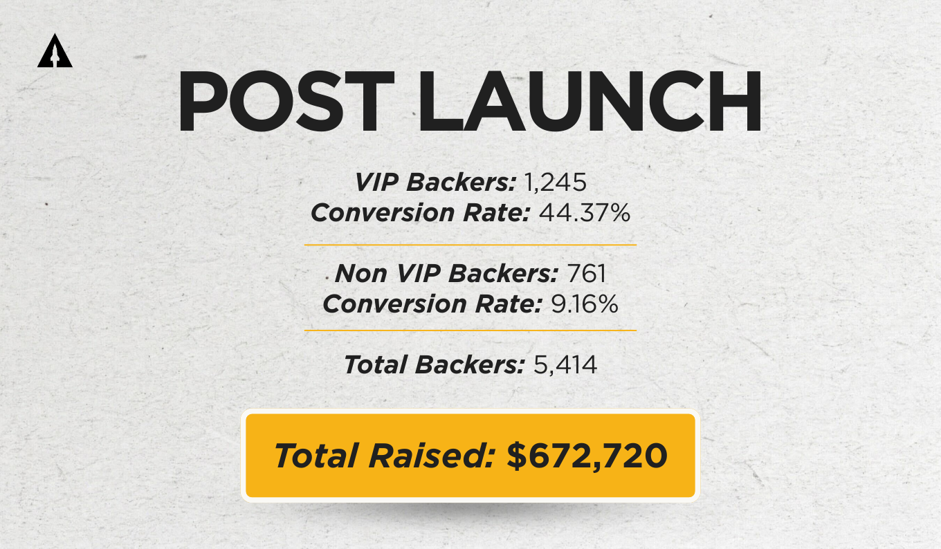
The Final Post-Launch Results
- 1,245 VIP backers (44.37% conversion)
- 761 non-VIP backers (9.16% conversion)
- 5,414 total backers
- $672,720 raised
By the end of the campaign, the numbers spoke for themselves: Sea Beasts had over 5,400 backers and $672,720 raised on Kickstarter.
What Actually Made the Difference
It would be easy to attribute this success to advertising alone, but that would miss the larger point of the full strategy’s effectiveness.
The ads worked because they were built on a clear understanding of the audience. The landing page converted because it was structured around how people make decisions. The scaling strategy succeeded because it relied on tested data rather than assumptions.
What surprised me most about working with LaunchBoom was all the integrations that went into running a campaign, and how I would’ve been lost without their integrations with tying everything together.
Aaron’s first campaign didn’t fail because the product lacked potential but because the system around it was incomplete.
The second campaign, now on Kickstarter, succeeded because the system was rebuilt from the ground up. With support from LaunchBoom, Aaron turned Sea Beasts into a crowdfunding success following a clear strategy and committing to a willingness to test, learn, and adapt.

[This post is part of Kickstarter's Partner Case Study series and was produced in collaboration with Launchboom.]