Introducing Our New Rewards Tab: A User-Friendly Solution for Exploring Project Rewards and Add-Ons
Our latest update simplifies the backing process by enhancing the visibility and comparison of project rewards.

Hi, I’m Matthew, a senior product designer here at Kickstarter. I work alongside our Product, Engineering, and Research teams to identify and solve problems for both creators and backers on our platform.
We’ve been working diligently over the past few months to build a better, more user-friendly way for backers to interact with a project’s rewards and add-ons.
Often, creators use our platform’s Story section to present and compare the rewards they’re offering, since the section provides ample space for visual representations and detailed explanations. This, however, can make it difficult for backers to find information, since they have to jump back and forth between sections of the Story and the project’s rewards cards.
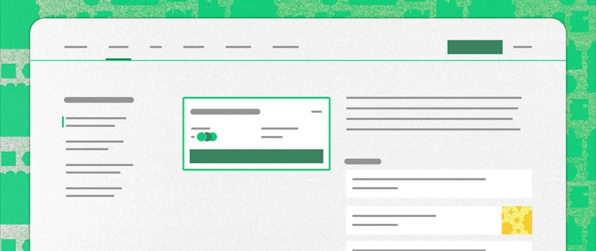
After working with backers and creators to understand more about their pain points and needs, then testing new design concepts, we landed on a solution that we’re really excited about: a dedicated tab on project pages for rewards and add-ons. We’ve also made some updates to rewards cards on the campaign tab.

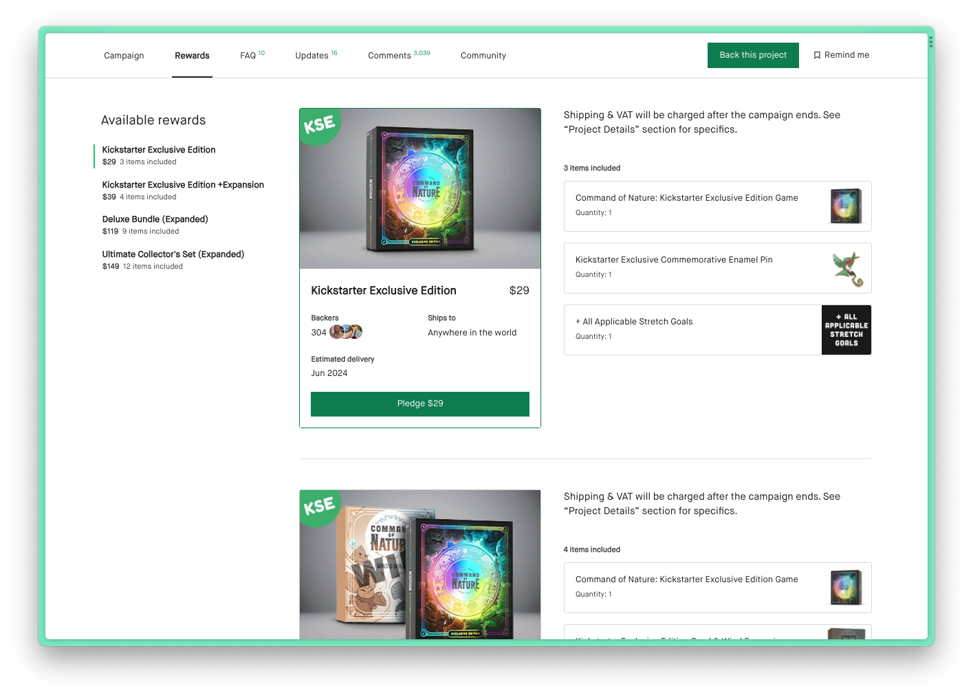
Our new Rewards tab enables backers to navigate swiftly between different reward options. This feature takes advantage of our recently added "images on rewards" functionality, allowing for larger and more visually appealing representations of rewards. In tests, we've found that these highly requested features greatly enhance backers' understanding of reward contents and facilitate easy comparison of project offerings.

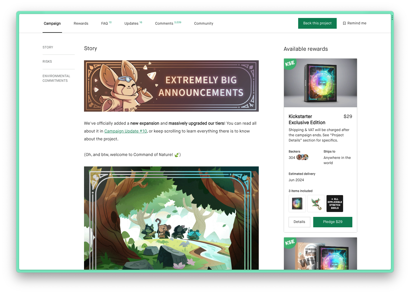
We’ve also updated the rewards cards on the Campaign tab to showcase images of items, as well as cleaned up the hierarchy and organization of information. We believe that the updated rewards cards will make it easier for backers to get an overview of each available reward before diving into the details of each through the new Rewards tab.
Check out a great example of the Rewards tab and cards in use from creator Ramy Badie, with their project Command of Nature:
• Make sure to include images for your reward items to make it easier for backers to understand exactly what’s included in each reward.
• Include images and descriptions for each add-on so that backers know what other items are available to them.
• Use the reward description to give a succinct high-level overview of the reward – avoid reiterating all the items that are included and all the add-ons that are available, since that information is now also accessible via the Rewards tab.
• Each of your rewards now has a unique URL that you can access via the Rewards tab. Use these in your marketing efforts to direct backers to specific rewards.

